As you know, we have many folks involved in the Marketplace. Readers, teachers, vendors, and performers, and we try to feature each of them on our website and in our program. This is easier in some cases than others, since some listings require extensive editing. Here’s a few tips that will help ensure yours is accurate and prominently featured.
Vendor and Psychic Reader Listings:
We need a good description of your business for the website and the program. We strongly prefer that these be written in third person (they, she, him) rather than first person (we, I, us). It is generally considered more professional, and it reduces confusion- It’s fine to use first person on your own page, but remember that in this case you’re having us relay that information on ours. It should sound like we are telling them about you, not talking about ourselves.
The ideal length of a listing on our website is between 50 and 100 words. Most software like Microsoft Office will have a “word count” under the “tools” menu, so you can check this. Any shorter than that, and it’s hard to get a good mental picture of your business. Any longer, and people are liable to get bored while reading and skip to the next thing.
Our program is much more compact. The ideal listing there is between 10 and 20 words (not including your name, of course). You can include a shorter version of your description, or we can come up with one.
Do not include your website or contact info in the listing itself. Your business name will link to it already.
Being colorful and descriptive will make your listing stand out much more than just running off a list of products.
“We offer a variety of handmade candles in unique scents and colors, along with candleholders and related items”
Is much better than
“We have vanilla soy candles, musk scented soy candles, beeswax candles in red, blue, purple, white, and green, plus silver candle holders, glass holders, wrought iron candellabras….”
Admit it- You already got bored reading that second one. Make people want to see your products- Don’t just give them a list and hope they find what they’re looking for.
Obviously, you should also proofread, and spell check your listing to make sure it’s free of any errors, has proper punctuation, etc.
Photos:

This is the big one. Your picture is going to be most peoples’ first impression of you, and they will judge you on it whether they mean to or not. It is important to have a good picture, but it is far more vitally important not to have a bad one. Don’t send us a selfie from your phone, or a snapshot taken at a friend’s birthday party or in the front seat of your car. It looks unprofessional, makes you look bad, and we can’t use it.
Readers and Presenters, we’ll need a head shot, which is the term for the picture that accompanies your bio. On the right, you’ll see a couple great examples from some of our past participants.
Charles Grant there in the blue suit has a very nice professional head shot. Something like this really gives a good impression. While there are photography studios that specialize in this, you can also go to the Sears or Walmart portrait studio and get something that will look relatively professional. Alternately, have a friend with a decent camera come over and take a few photos either in front of some trees or a simple textured background like a brick wall or wooden fence. Get something that shows you clearly, and conveys something about your personality. The picture of Bety Comerford here is a great example. You want a simple picture where the person is the main focus, and the background is just enough to keep it interesting without being cluttered and haphazard.

And here’s a secret that professional photographers use every day: Don’t take a picture- Take 40 or 50 pictures and then pick out the best one. In this digital age where there are no costs to develop a roll of film, there is no excuse not to. If you ever look at a photo spread of a dozen pictures in a magazine, it’s a sure bet that the photographer took literally hundreds of photos to get those few good ones.
Merchants, we’d love to feature photos of your merchandise. Because of space limitations, we can’t have pictures of everyone, so we pick and choose the best ones. Here’s a couple tips to make us more likely to use yours.
Send a picture that uses good lighting and sharp focus, and is at a high resolution. This is absolutely vital. Remember what we just said about portraits- Take a hundred pictures and pull out the best three.
There are basically two types of photos that work well- Ones that show your quality, and ones that show your selection. Any given photo is really only going to be able to do one or the other- not both at once.
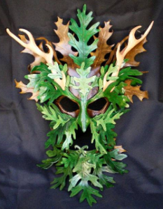 For the first kind, do a close up of one or (maybe) two items. They should be on a neat and fairly simple background. Try to highlight one of your favorite features like the color, craftsmanship, or details. On the left is a nice picture from one of our vendors, Wardsworth Leather: This is a picture that clearly shows what looks like a well made item. While it’s only a single example, it gives a very good impression of what sort of quality this vendor produces.
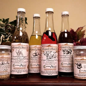
For the second, try to show a number of similar items arranged neatly together. It’s hard to visually convey something like flavor, but this picture from Cucina Aurora gives you an idea of the range of products and varieties they have to offer.
What you don’t want to do is send us a picture of your entire booth, or of several different kinds of products jumbled together.
Rummaging through racks of clothing may be great fun in person, but in a photograph, even a neatly sorted display just looks messy and confusing.
Honestly, we could go on for another couple hours, but the bit we’ve given here should be enough to get started and help us do the best job we can do of sending you paying customers.
-The MMPF Committee